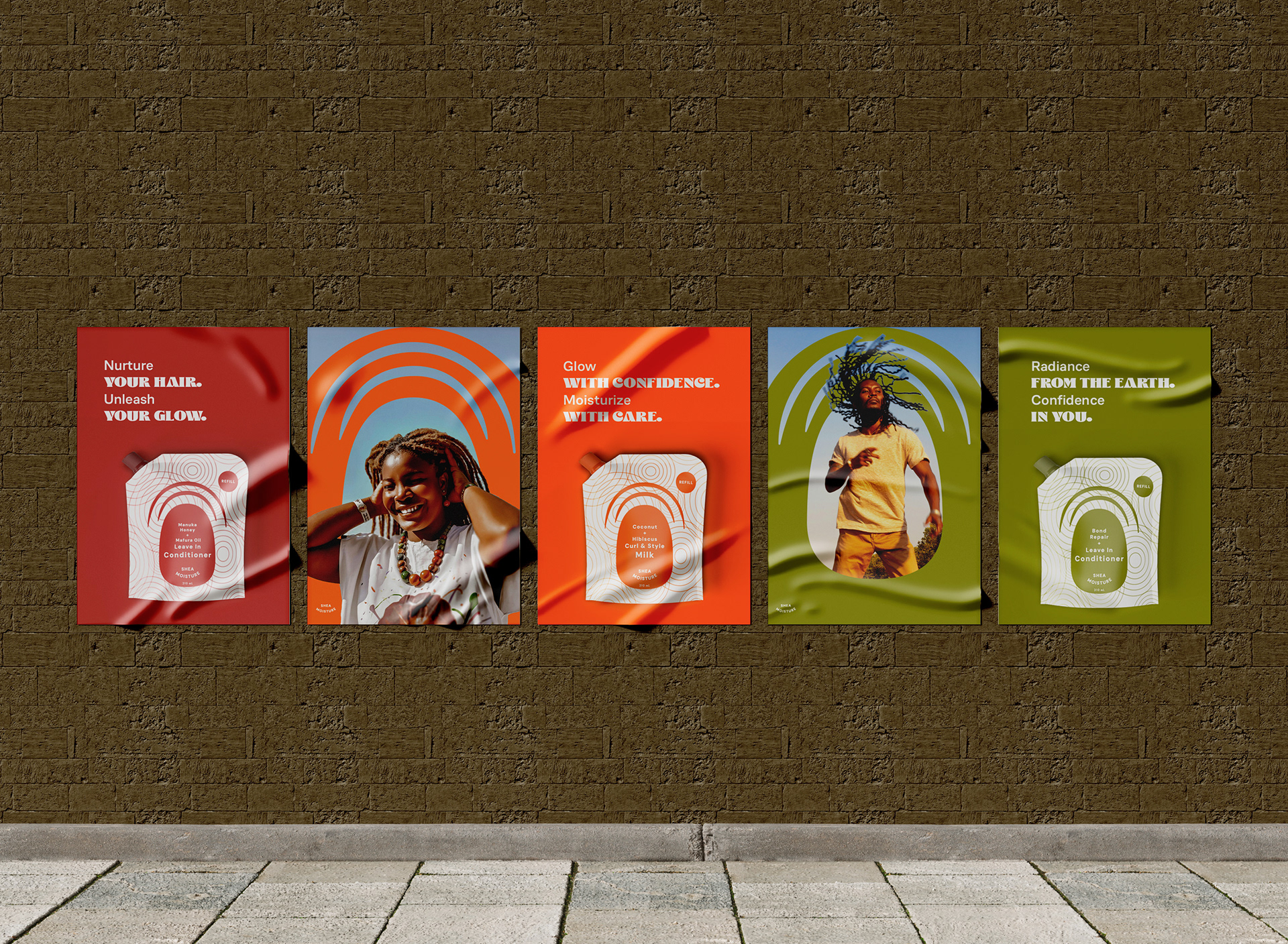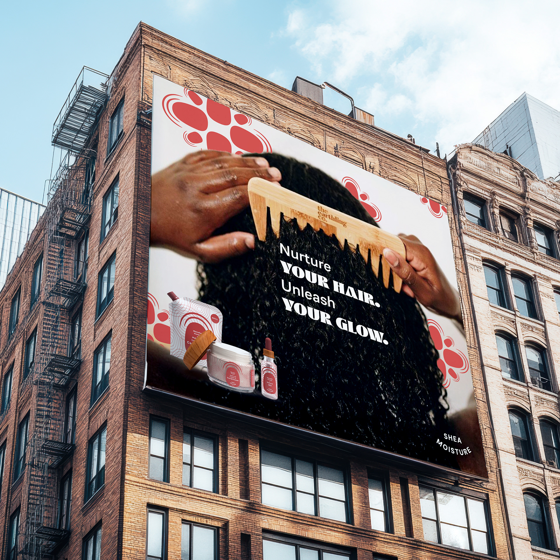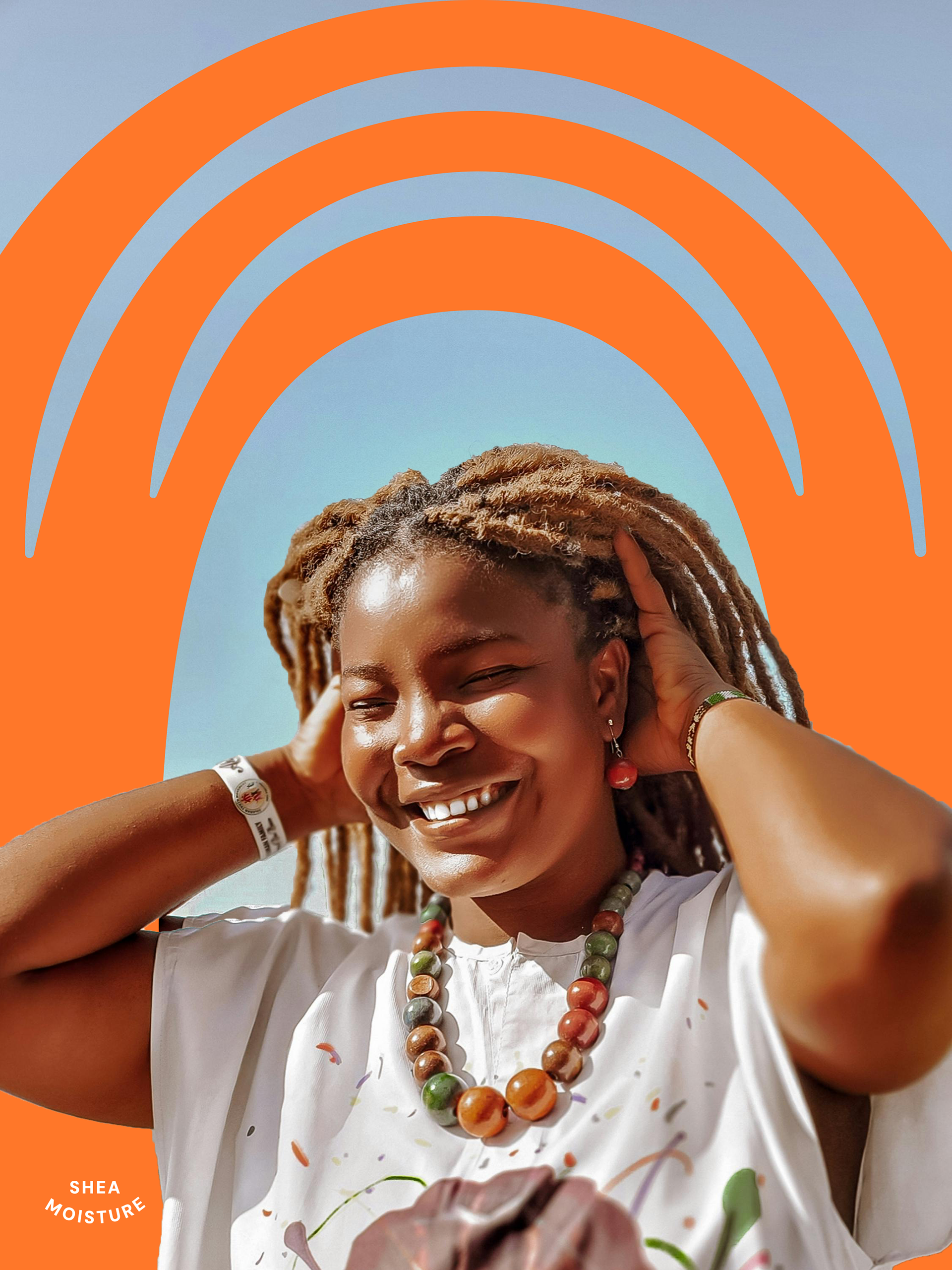
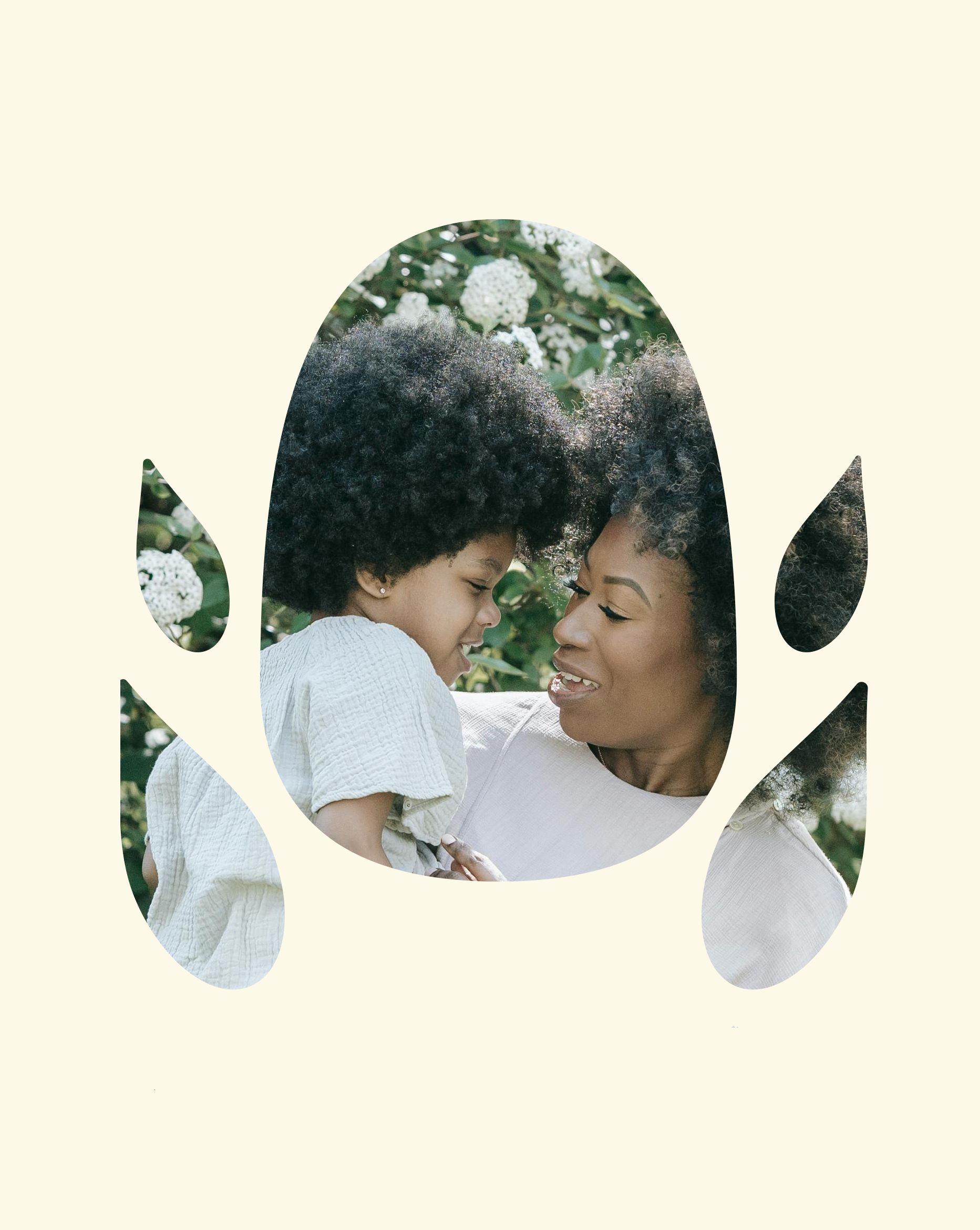
Shea Moisture’s outdated identity no longer reflected its mission or heritage, creating a disconnect with its audience. I reimagined the brand with a modern yet rooted design, ensuring its purpose—Spreading Empowerment through Heritage—remains central. This transformation revitalized its visual identity while strengthening its legacy and relevance.
brand story
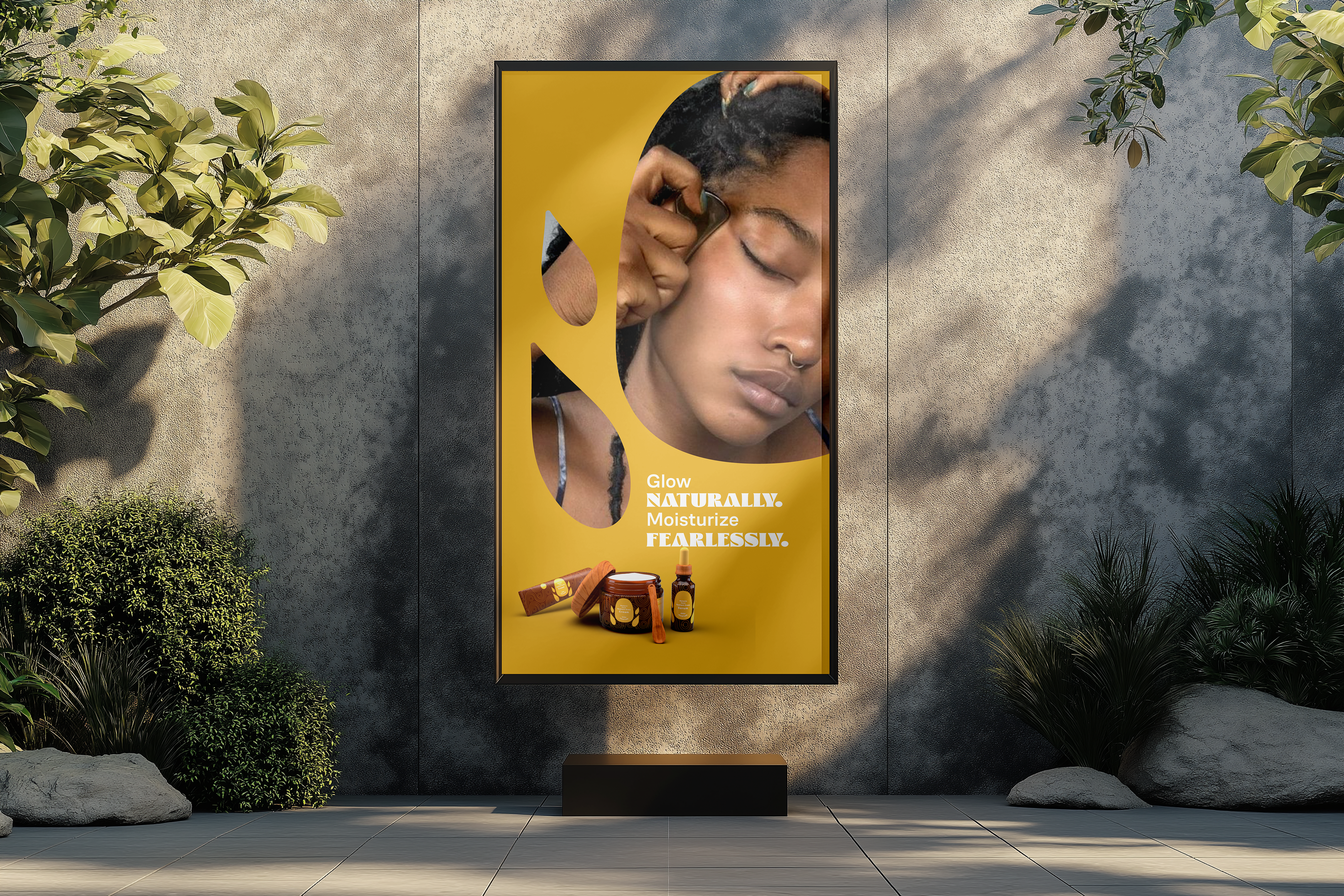
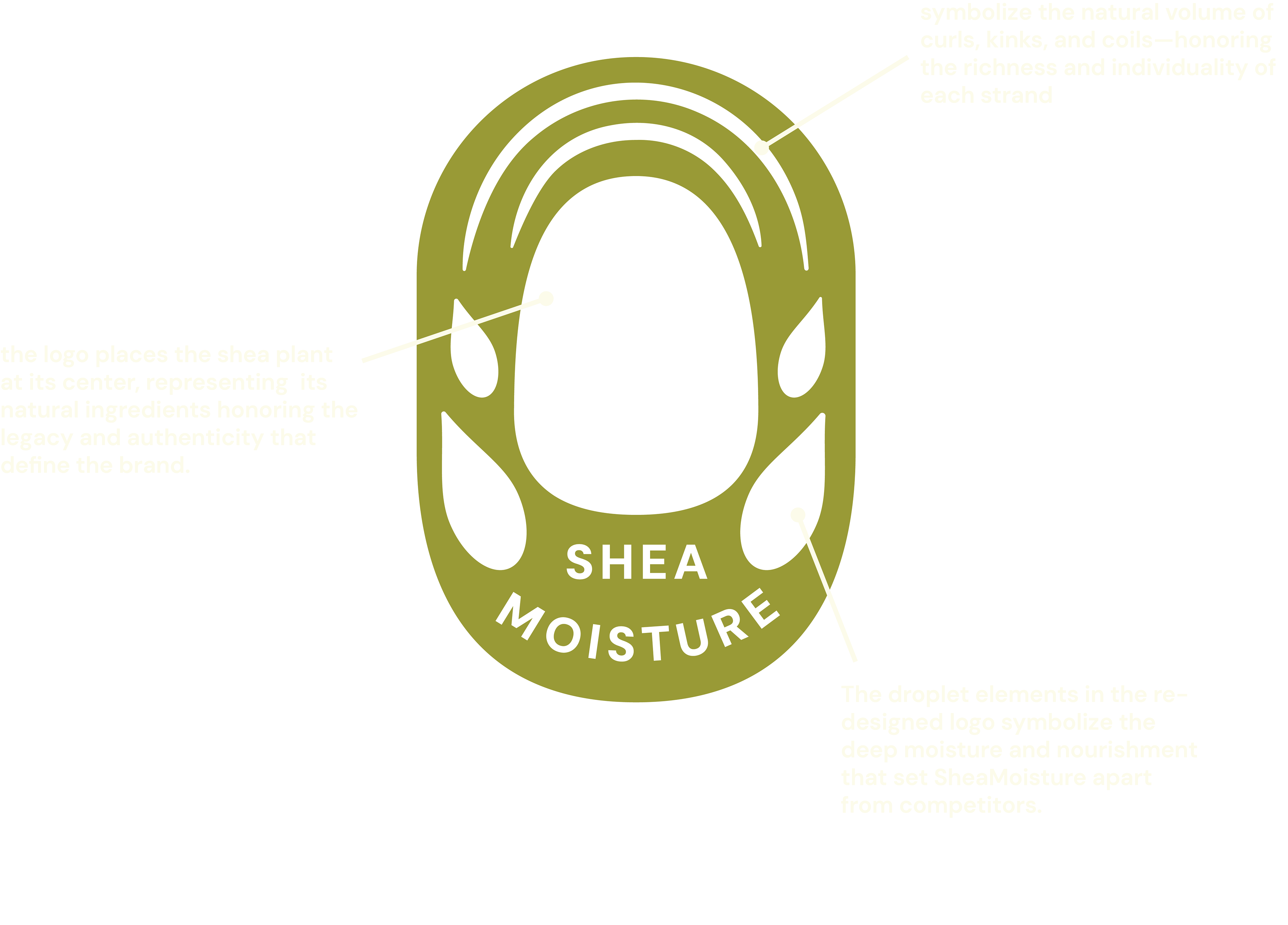
Spreading Empowerment through Heritage
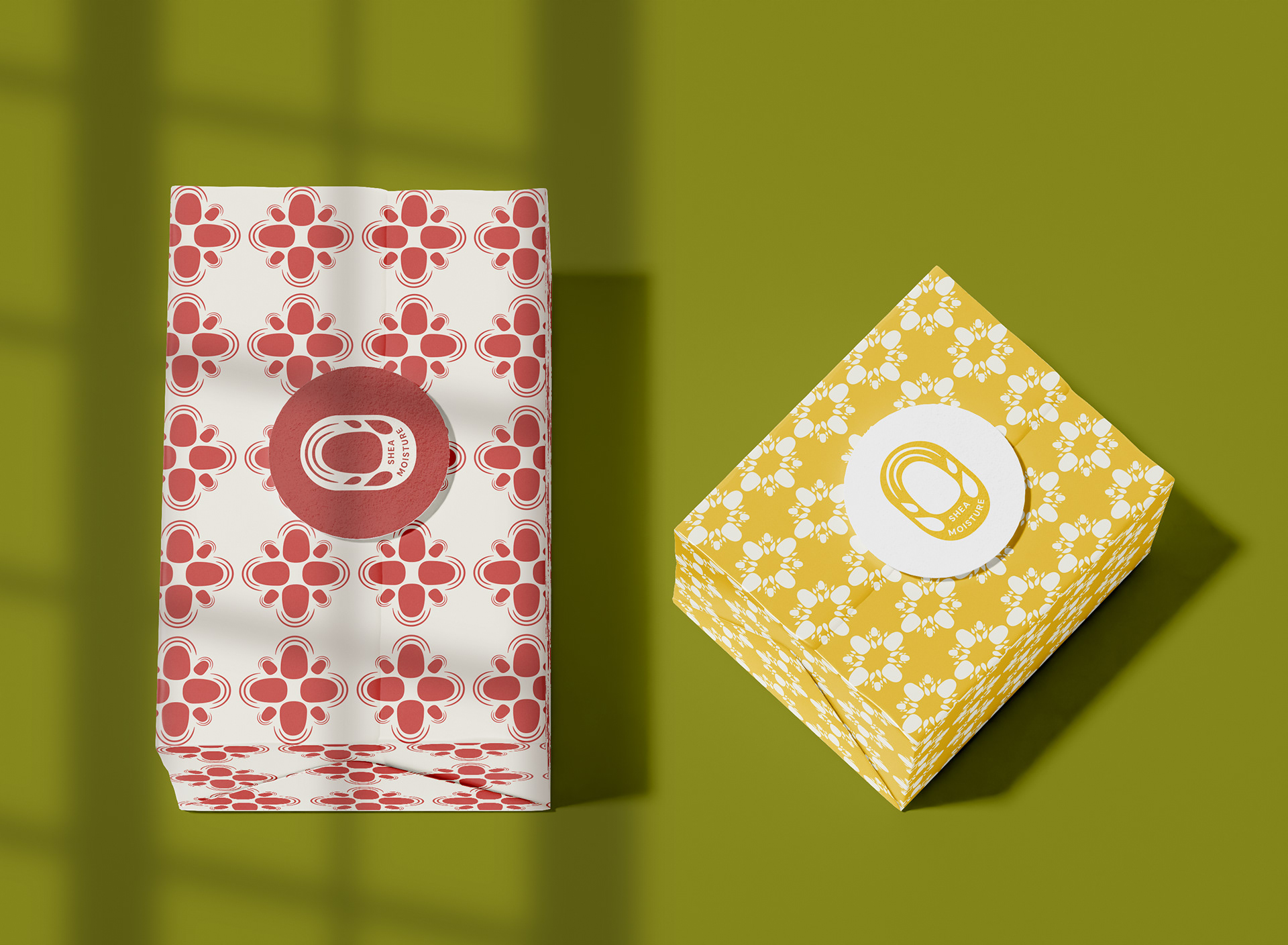
Logo meaning
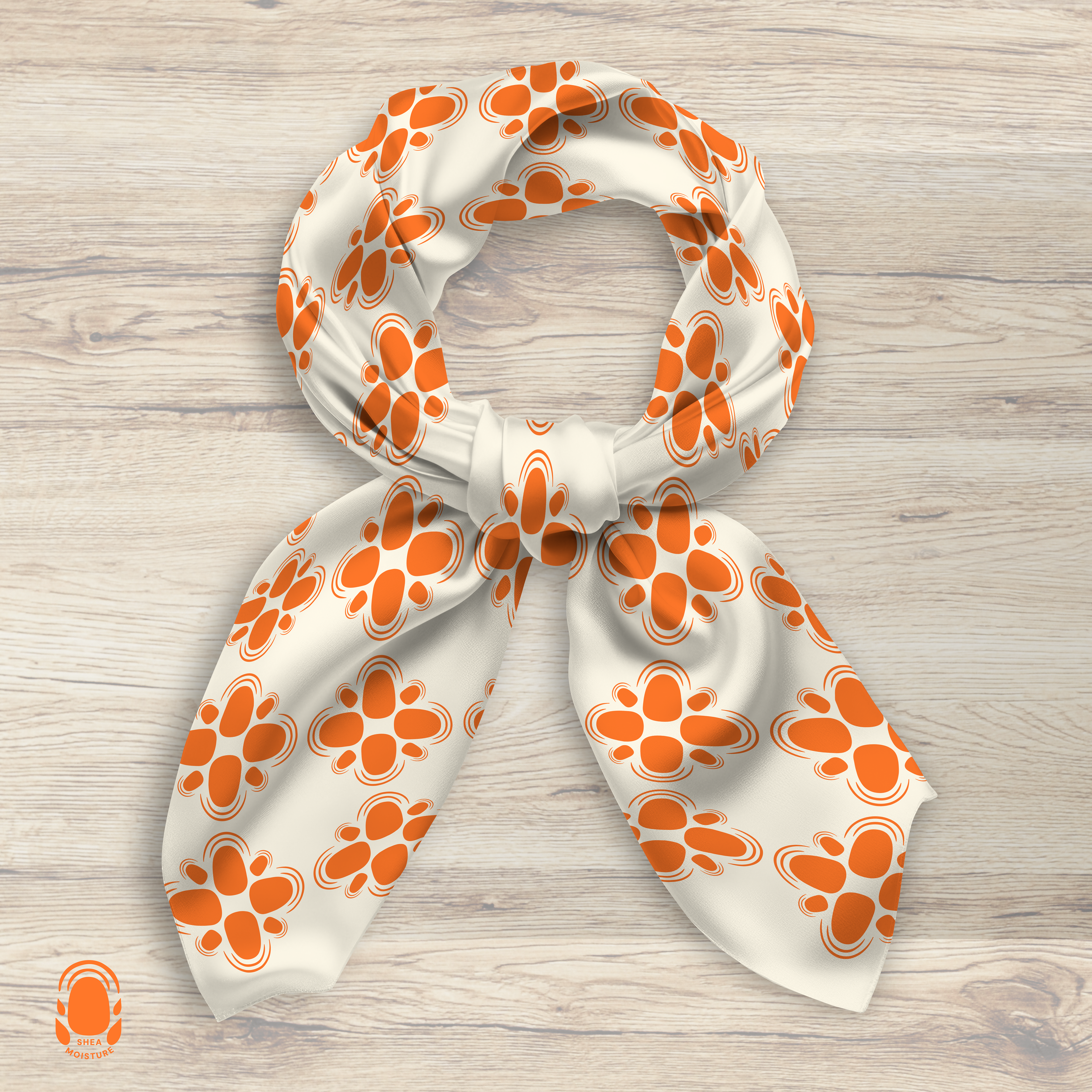
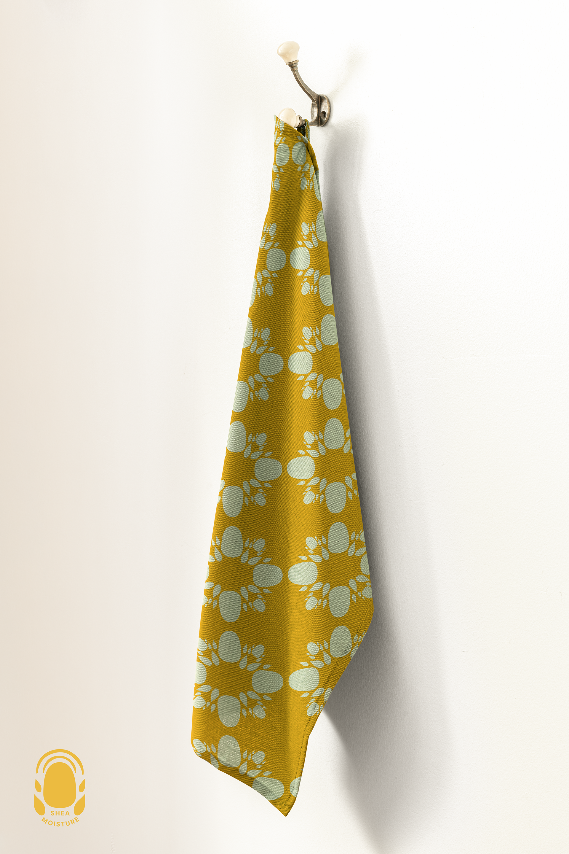
Color Palette
Product Logo
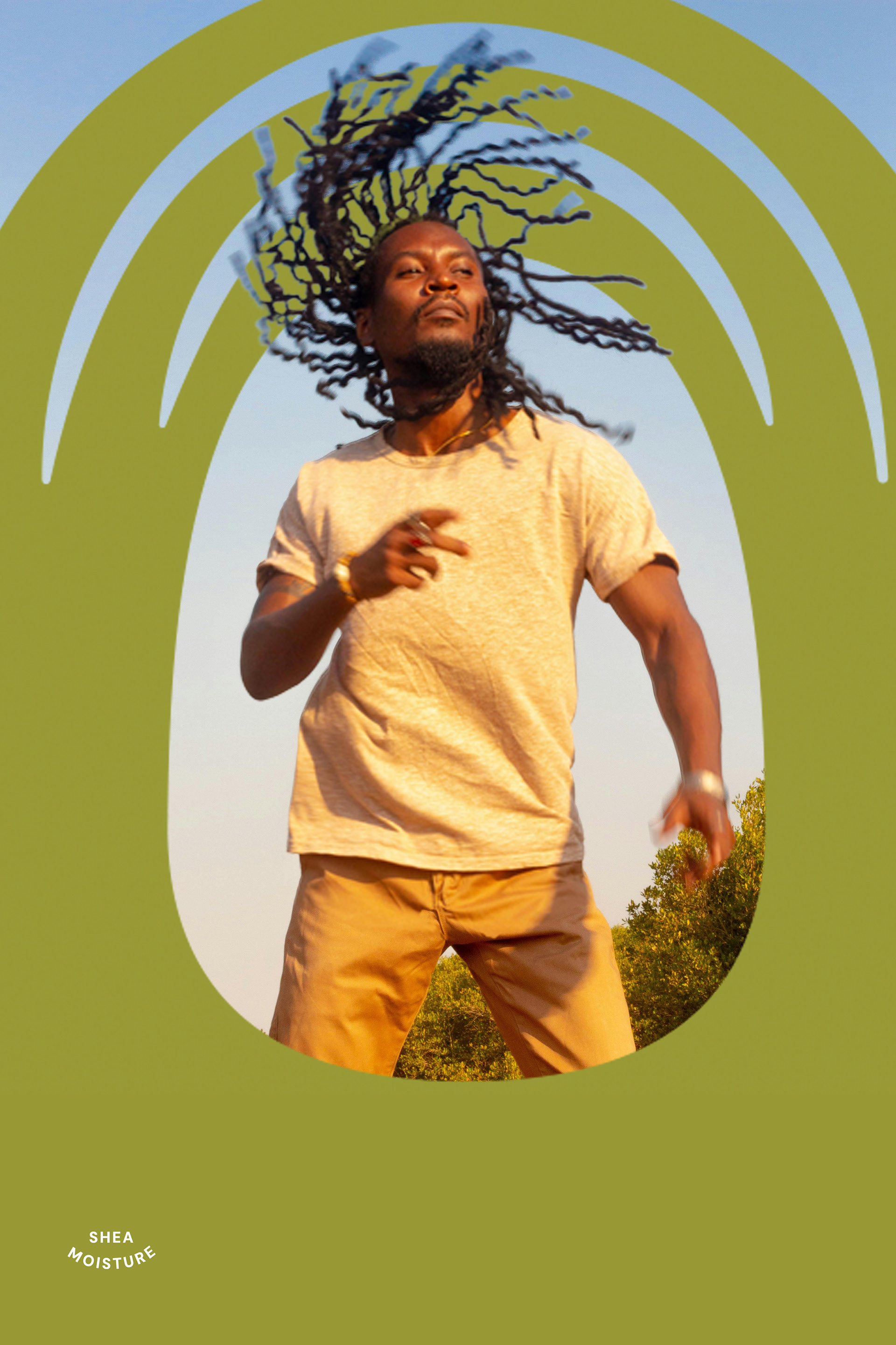
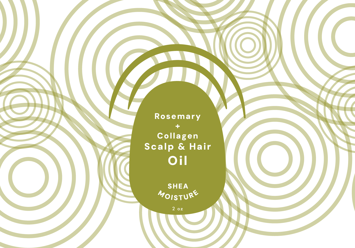
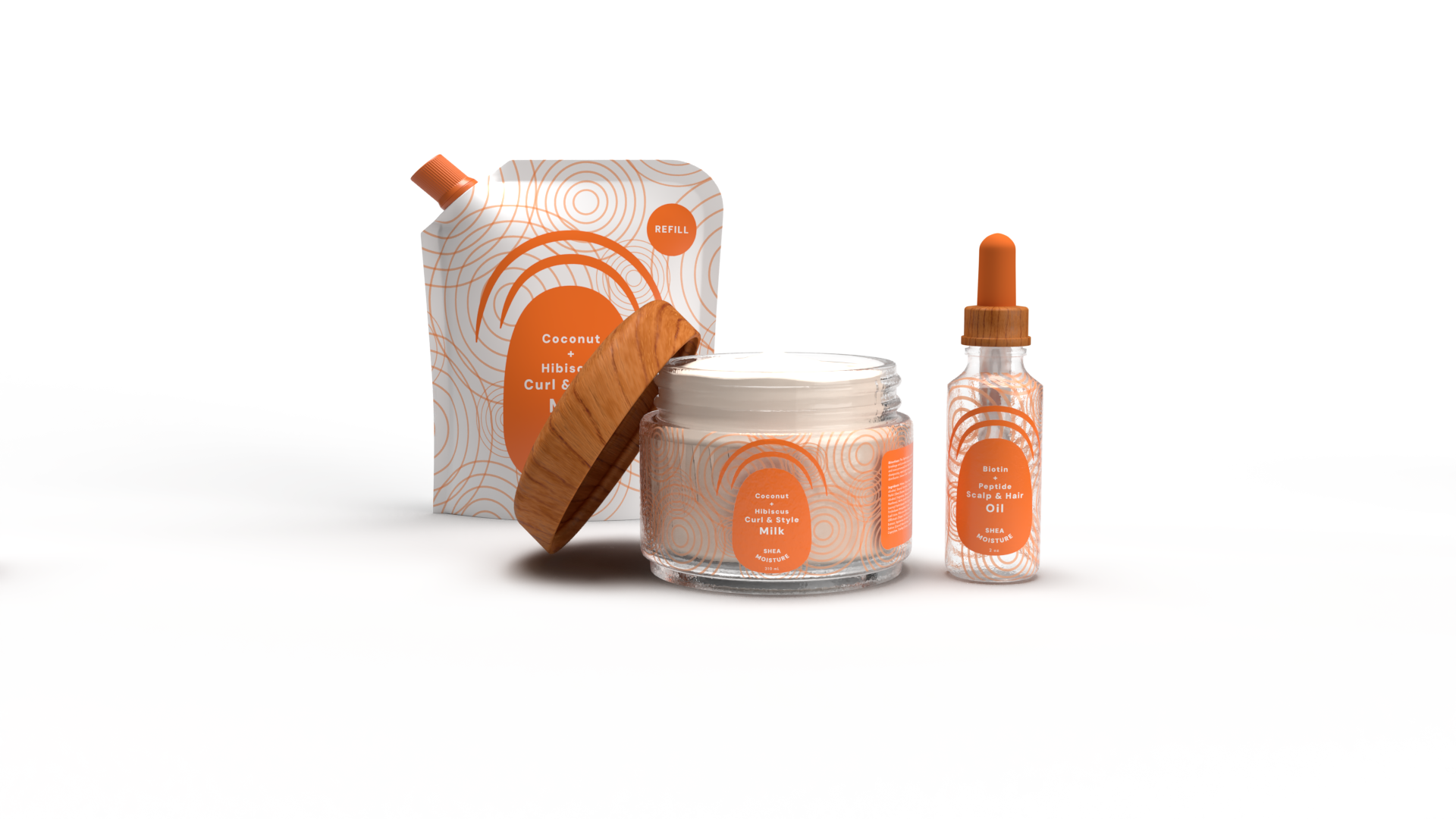
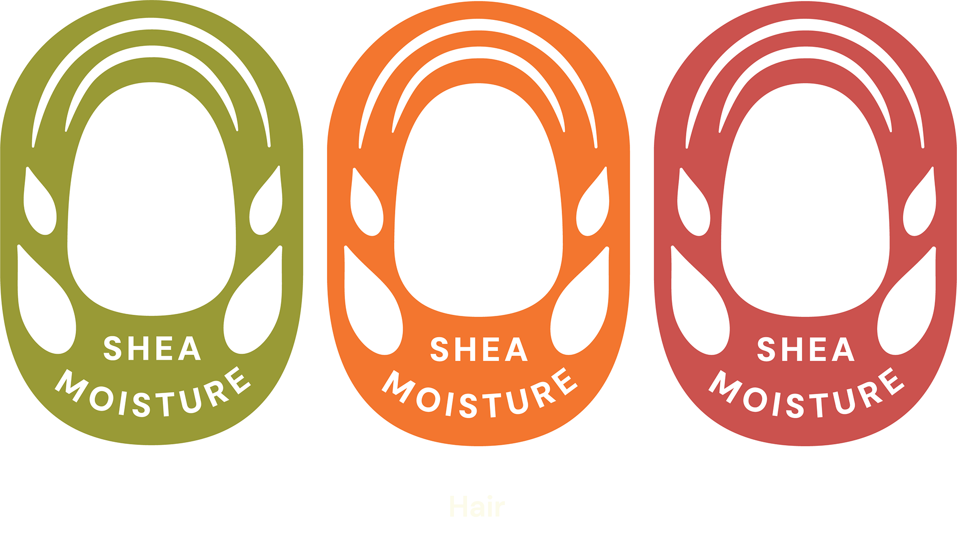
Hair
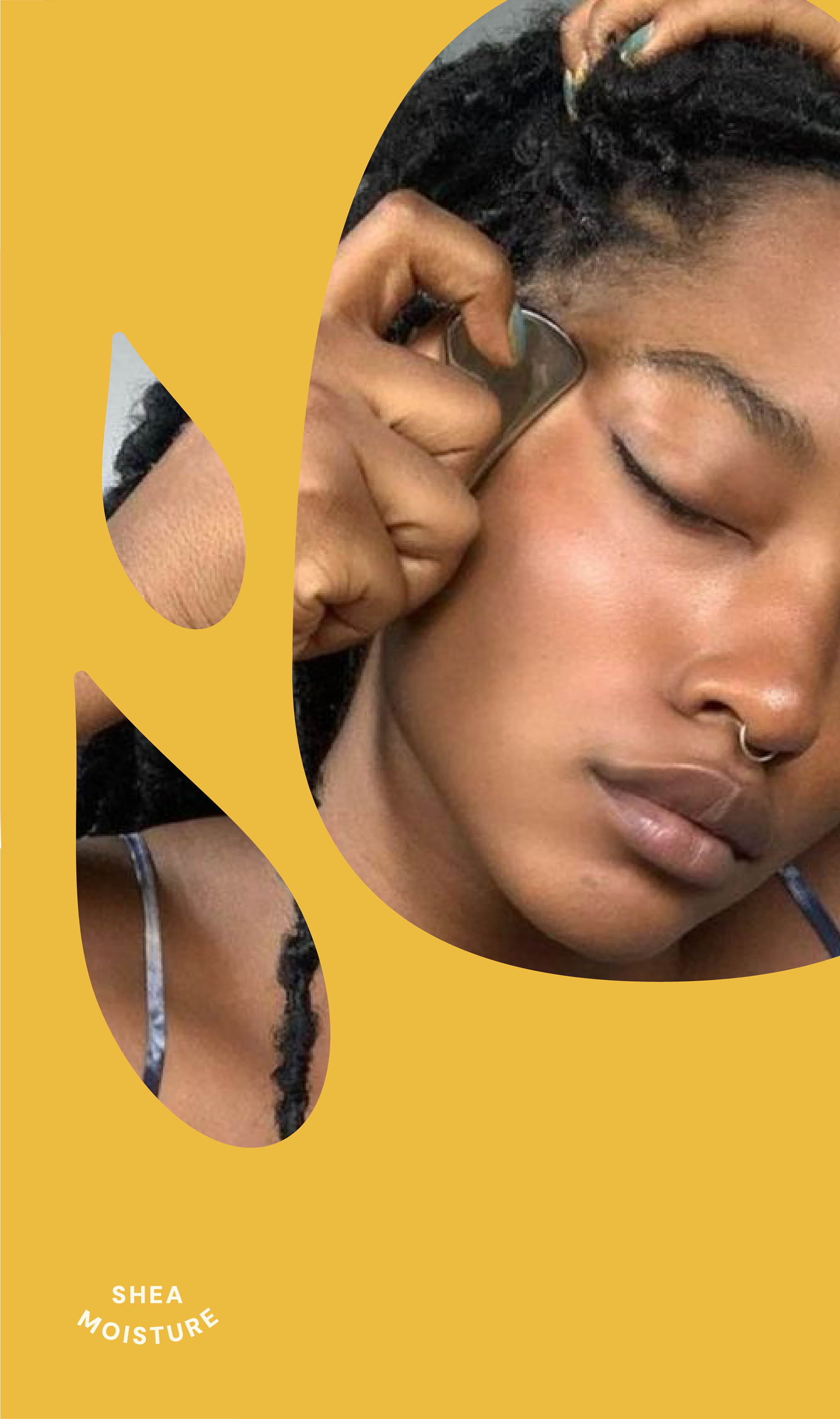
The redesigned Shea Moisture hair logo and package is a tribute to the beauty and diversity of textured hair. Its flowing, organic forms symbolize the natural volume of curls, kinks, and coils—honoring the richness and individuality of each strand. This refreshed identity reflects SheaMoisture’s commitment to uplifting and celebrating the natural hair community, embracing the authenticity, strength, and versatility that define it.
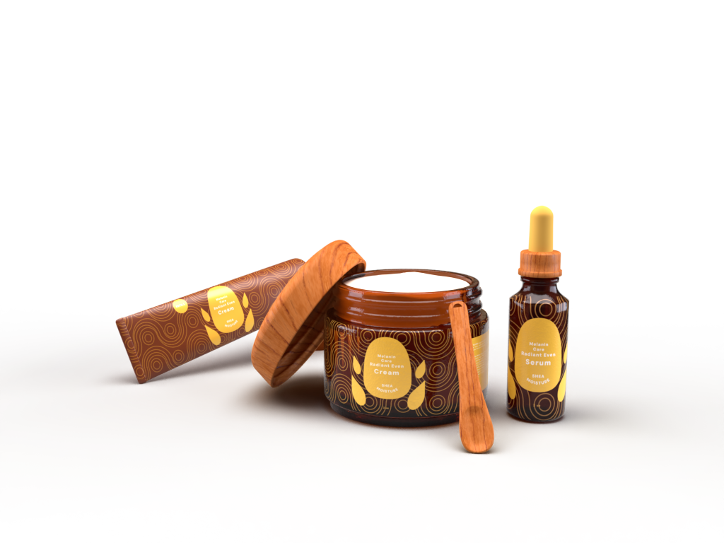
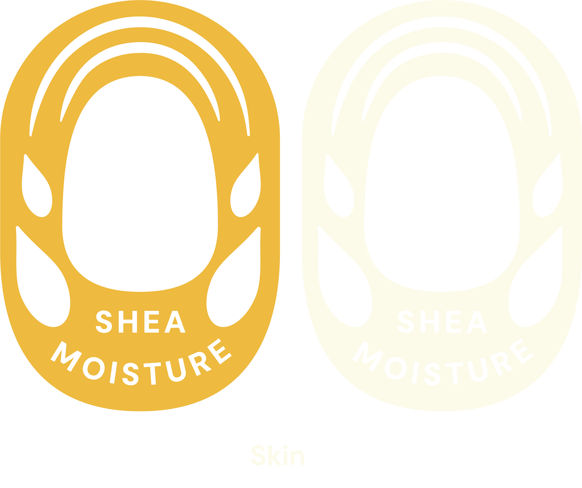
skin
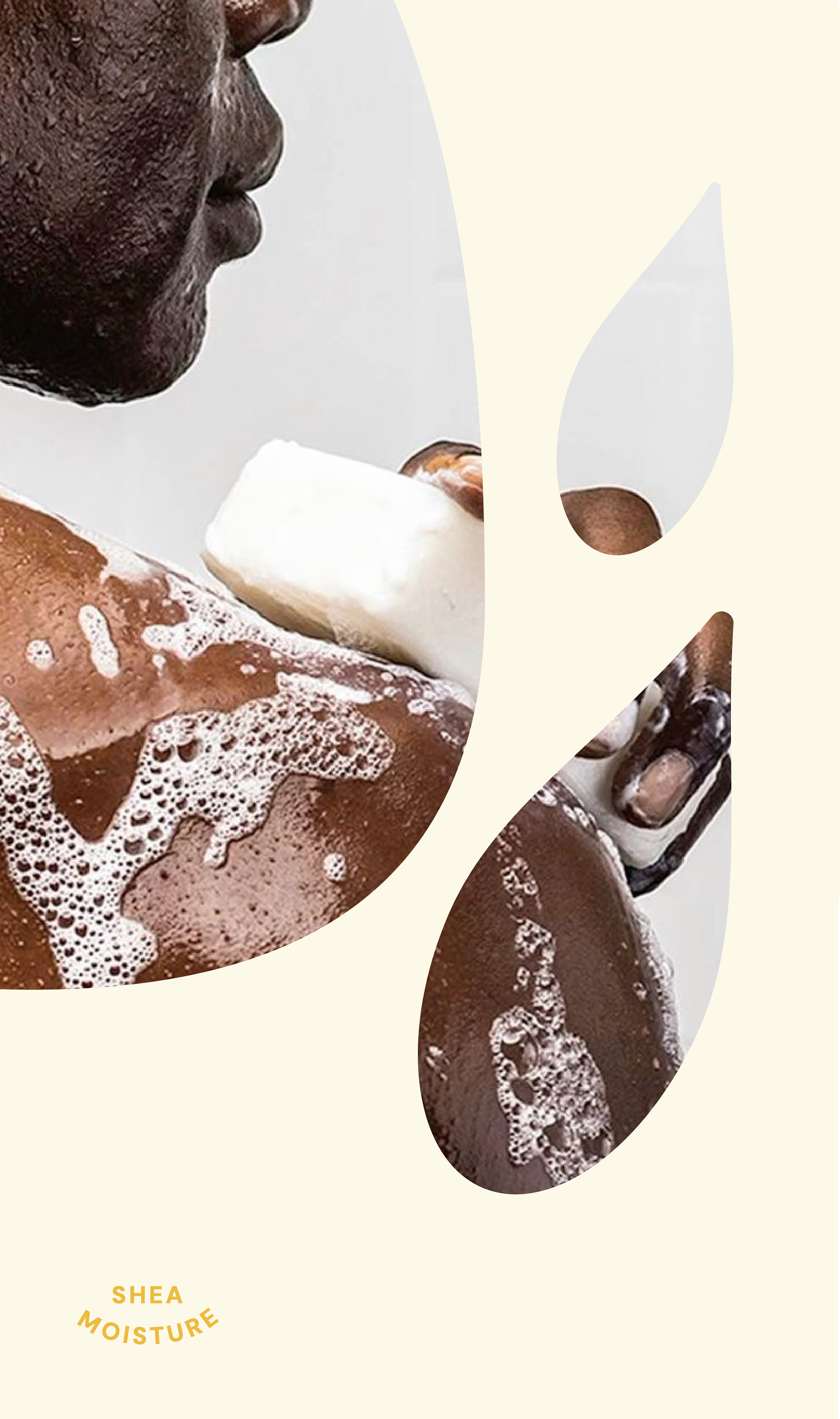
The redesigned skin care logo represent the intense moisture and nourishment at the heart of SheaMoisture’s skincare products. This visual cue reinforces the brand’s dedication to rich, restorative hydration that sets it apart from competitors.
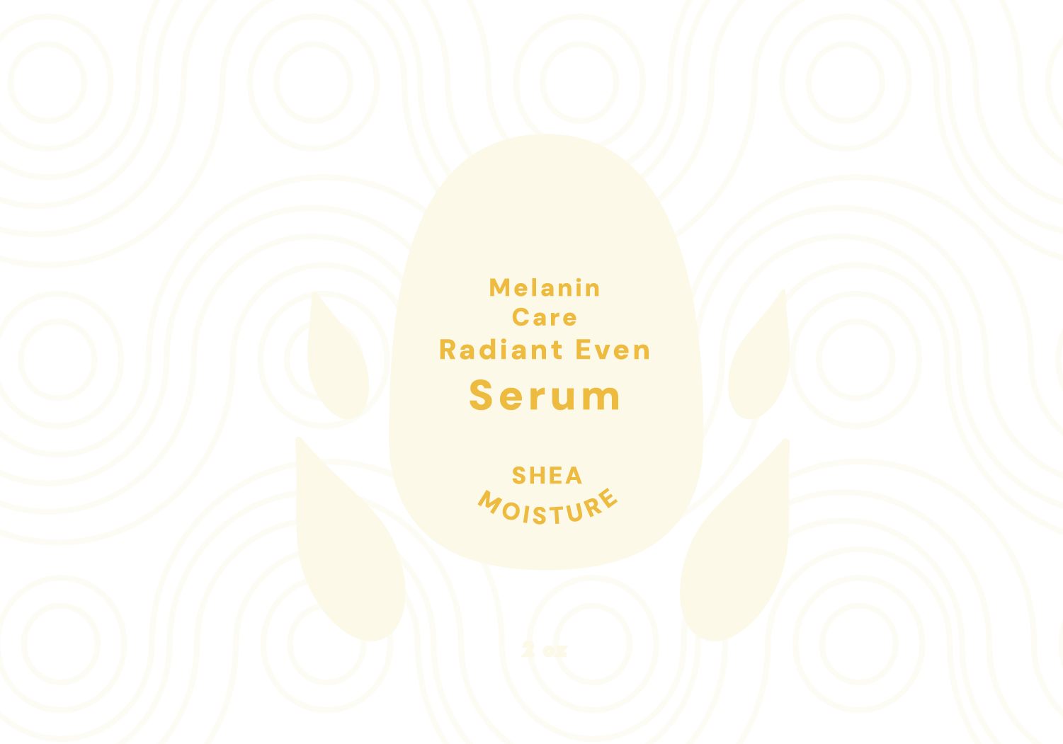
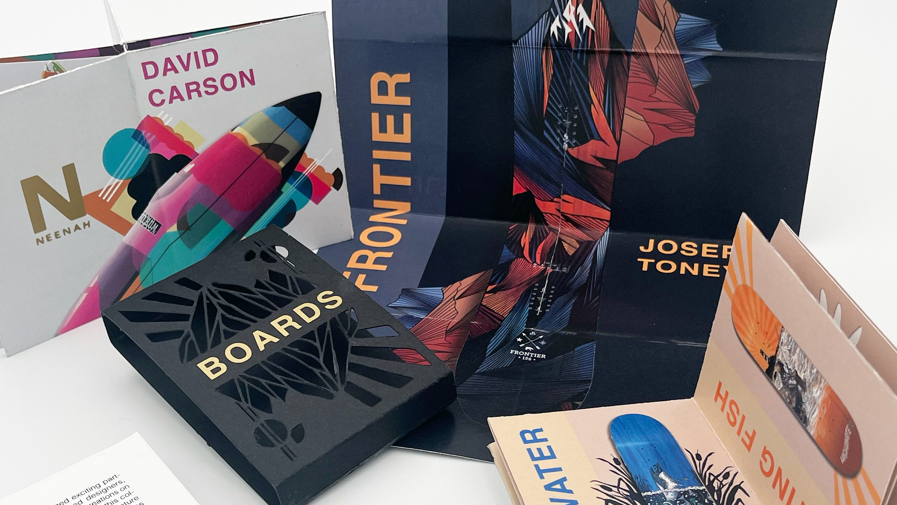
Packaging